
A tidy Claremont study setup, without the clutter
The brief came from a student in Claremont who wanted a neater study system for exam prep, class notes and project folders. The labels had to do more than look neat. They needed to stay readable on books, file covers and plastic crates that moved between a bedroom, a study corner and a shared car trip to campus.
We worked around a few practical limits. The labels had to print cleanly on a home printer, cut neatly by hand where needed, and still hold detail on small tabs. The student also wanted a finish that would not reflect too much light, because study notes and counter lamps can make glossy surfaces harder to read.
- Subject labels for books, files and dividers
- Revision tabs for quick section marking
- Small crate labels for storage and sorting
- Printable sheets sized for home use
Paper choices that matched the job
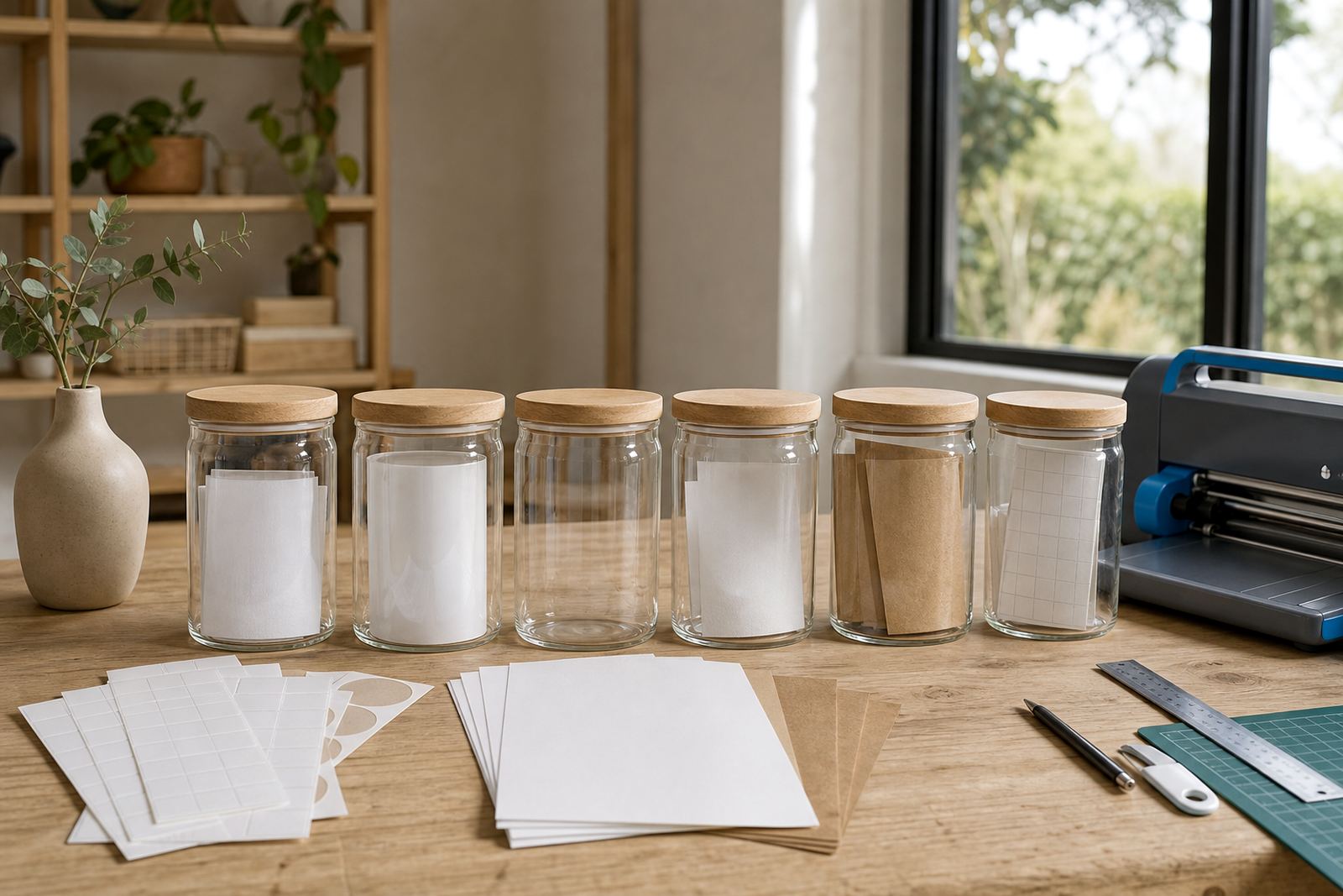
For this project, the key was choosing sticker paper that suited both the print method and the surface it would go onto. Matte stock gave a calm finish for text heavy labels. Gloss worked better where colour blocks and icons needed a brighter surface. Clear sheets were useful for a cleaner look on pale covers, while vinyl gave extra durability for items handled often.
Kraft paper suited a more natural look for folders, gift style labels and home organisation pieces, especially where the design used darker ink and simple shapes. The student printed most sheets on an inkjet printer, but we also set up options that can work with laser printers where that is the machine in the home or office. The point was to keep the labels sharp, not fussy.
- Matte for easy reading on study notes
- Gloss for brighter colour and visual contrast
- Clear for a low-profile finish on light surfaces
- Vinyl for longer handling on storage items
- Kraft for a warm, natural look on labels and tabs
Cut lines, tabs and small shapes that stayed usable
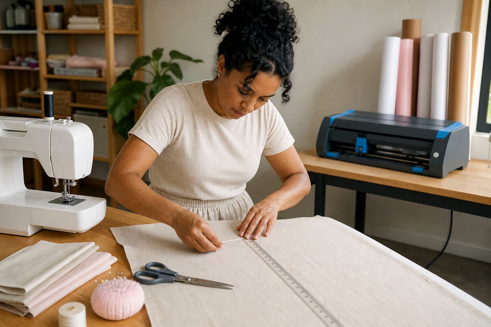
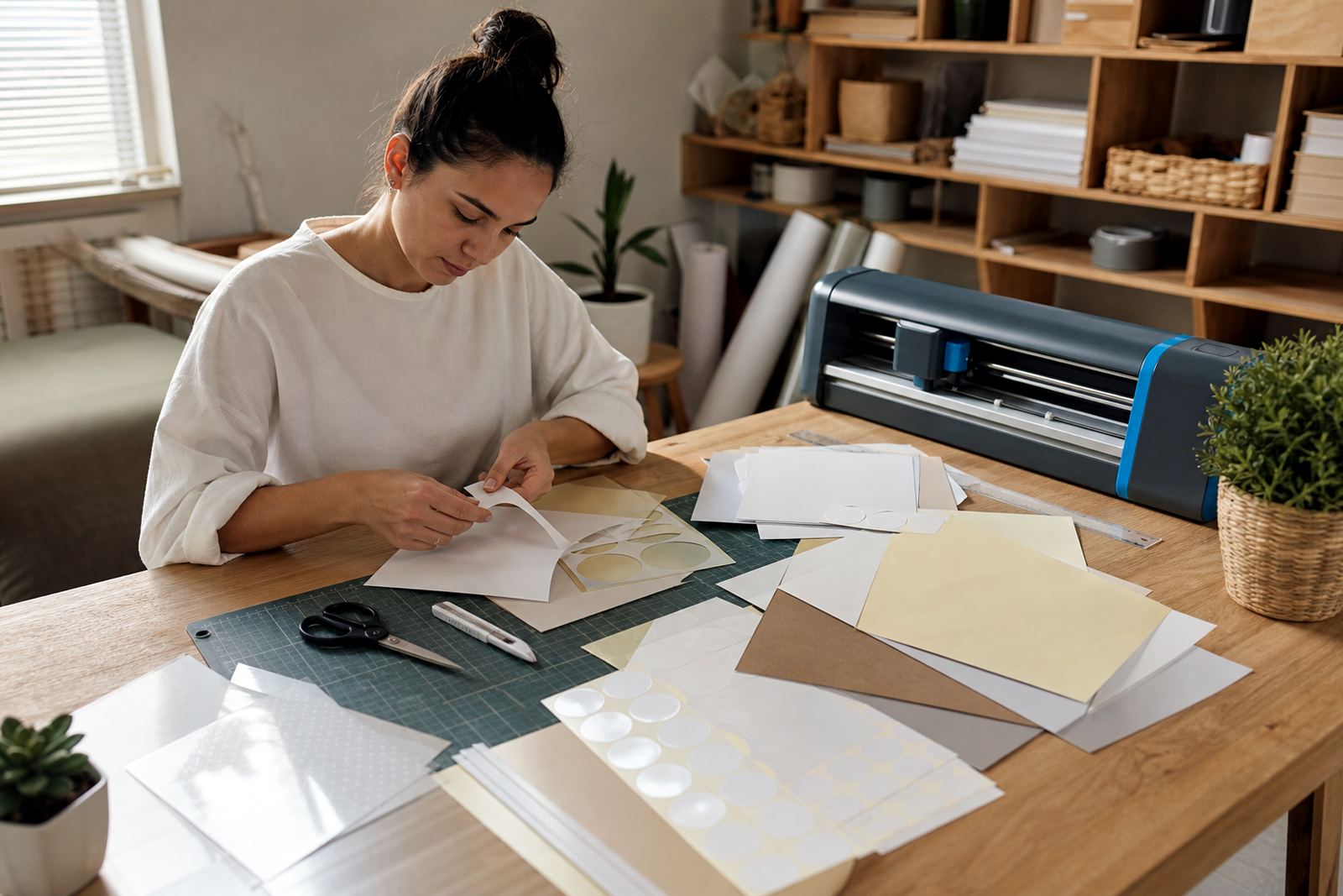
The study set included slim labels, arrow tabs and a few wider markers for topic sections. Those shapes need clean edges, otherwise they lift at the corners or look untidy once they go on and off books. We planned the layout so the labels could be trimmed by hand with scissors, or cut on a craft cutter where the user wanted a more regular finish.
Care mattered here. The sheets were stored flat in a dry place before printing, and the print side was tested first for colour balance and ink drying. That helped avoid smudging on smaller pieces, especially where the text was tight and there was not much margin to spare.
- Small tabs for revision sections
- Longer labels for book spines and file fronts
- Simple shapes that cut well by hand
- Cutter-friendly layouts for repeat shapes
What we supplied for the Claremont project
We prepared a mixed set of printable sheets for the student, with enough variation to cover study books, lever arch files and storage crates. The set used a combination of matte and gloss finishes so the user could see which surface worked best for different jobs. A few clear sheets were included for lighter coloured folders, and one kraft option was added for a more natural study label style.
The support side was practical too. Printer setting help covered paper type, print quality and drying time. Colour test help was used to check whether the icons and subject names stayed legible at smaller sizes. For the cut pieces, we gave basic guidance on blade pressure, corner radius and safe handling, because a neat tab is only useful if it survives daily use.
- Printable sheets for subject labels and revision tabs
- Inkjet and laser friendly options
- Guidance for colour testing and print setup
- Help with hand cutting and craft cutters
- Advice on sticker application to books and crates
A short timeline from brief to finished study labels
The project ran over two weeks, moving from the first layout idea to the final printed set. The first week focused on the label sizes, subject naming and the balance between text and colour. The second week was used for test prints, trim checks and surface matching for books, files and crate lids.
That pacing suited the work. It gave enough room to deal with a few common issues such as paper feed, slight colour shifts and the choice between a shiny or low-glare finish. Nothing complicated, just careful checking before the labels went into daily use.
- Week 1: layout, sizes and finish choices
- Week 2: test prints, cut checks and final set up
- Final use: books, files, revision tabs and study crates
What changed once the labels were in use
The finished labels made the study space easier to manage. Subjects were quicker to spot, revision tabs sat neatly in the right places, and the storage crates no longer needed guesswork. The student could separate term work from exam prep with a much clearer system, which cut down on sorting before study sessions.
Durability also held up well for the way the labels were used. The student handled books daily, moved files between rooms and lifted crates often, so the chosen material had to cope with repeated touching. A few labels were replaced later, but the core set stayed readable and kept its shape. That was the right outcome for a home study setup in Claremont, where space is often shared and needs to work hard.
- Clearer subject grouping across books and files
- Faster sorting before study sessions
- Better visual order in small storage crates
- Labels that stayed readable through daily handling
What we would do for a similar order
We would keep the same mix of finishes, because study labels are rarely all used in one way. Matte works for notes and text, gloss suits bold colour, clear helps on pale covers, vinyl adds durability and kraft brings a more natural look. That mix gave the student choices without overcomplicating the order.
We would also keep the small practical checks in place, especially around printer settings and cut size. Labels for books and revision tabs need a neat edge, and tiny changes in layout can make a sheet harder to use. With the right material and a clean print setup, the whole system stays easy to manage.
- Keep a mix of finishes for different surfaces
- Test small text before printing the full set
- Leave enough margin for hand cutting or craft cutters
- Match the label size to the way the student files work
Key facts
| Project | Claremont Study Labels |
|---|---|
| Client type | Student project |
| Town | Claremont, Cape Town |
| Materials used | Matte, gloss, clear, vinyl and kraft printable sticker paper |
| Print compatibility | Inkjet and laser |
| Timeline | 2 weeks |