
A pantry that needed order without looking crowded
The brief came from a home organiser in Brackenfell working on a pantry refresh for a family kitchen. The labels had to look clean, stay legible on different container shapes, and suit a mix of glass jars, white plastic tubs and woven baskets. The finished set needed to feel consistent, not like a pile of different labels stuck together haphazardly.
The client wanted two finishes for the same project. Clear printable sticker paper was used where the container colour could do part of the visual work, while matte printable sticker paper was chosen for labels that needed a softer, more solid block of text. That split kept the pantry tidy without making every shelf look identical, which mattered in a room with open shelving and bright daylight from the side window.
Paper choices that matched the containers
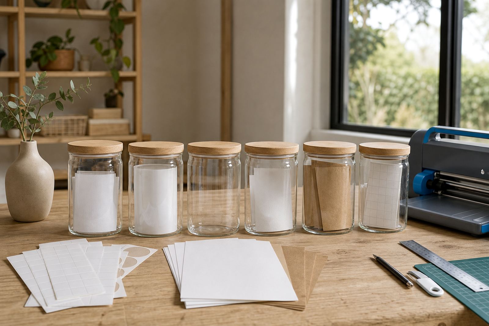
We put together a small set of sample sheets and guided the client through the main differences between matte, gloss, clear, vinyl and kraft sticker paper. For this pantry, matte gave the most forgiving finish for printed ingredient names and shelf markers, while clear worked well on jars where the label needed to sit quietly on the surface. Vinyl was discussed for extra handling resistance on high touch containers, although the final order focused on matte and clear sheets.
Sheet size and printer type mattered too. The labels were planned for both inkjet and laser compatibility, so the organiser could print on the office machine at home without running into coating problems. The design set was arranged to suit smaller pantry labels, medium jar fronts and a few wider container panels, with cutting lines laid out for hand cutting and craft cutters. A clean cut makes all the difference, even a tiny skew shows on a row of jars.
- Matte sheets for ingredient names, category labels and shelf markers
- Clear sheets for glass jars and see-through canisters
- Inkjet and laser compatible options for flexible home printing
- Shapes prepared for hand cutting or craft cutter use
- Sizes planned for small jars, tall containers and flat bins
Printing notes for a sharp result at home
The household wanted labels that printed cleanly the first time, not after a stack of test pages. We covered printer settings, colour checks and basic drying care for the printable sticker paper. That included matching the paper setting to the sheet type, checking the print preview for spacing and allowing enough drying time before cutting or peeling. On some inkjet jobs, a light touch matters more than people expect.
For the gloss finish, the advice was to use it only where a brighter look was wanted, because too much shine can make small text harder to read under kitchen light. The organiser kept the gloss option for a few decorative labels on gift jars, while the pantry core stayed matte and clear. The balance made the room feel neat without turning it into a display only shelf.
- Printer setting help for inkjet and laser use
- Colour test guidance before the full sheet run
- Smudge reduction notes for fresh prints
- Basic sheet storage advice to keep edges flat
- Sticker application tips for smooth, dry surfaces
Cutting, sorting and sticking the set into place
The project ran over two weeks from the first paper selection to the finished pantry label set. In week one, the organiser reviewed the finish options and chose the mix of clear and matte sheets. We then prepared the label sizes and cut paths. In week two, the sheets were printed, trimmed and organised by pantry zone, which made it easier to label baking goods, breakfast containers and dry staples in one pass.
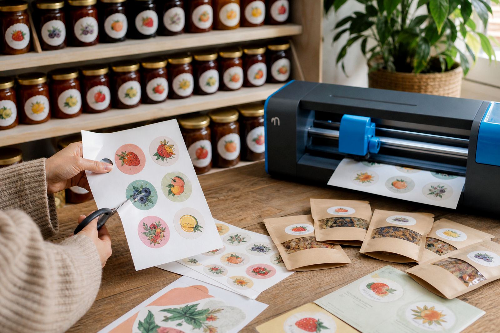
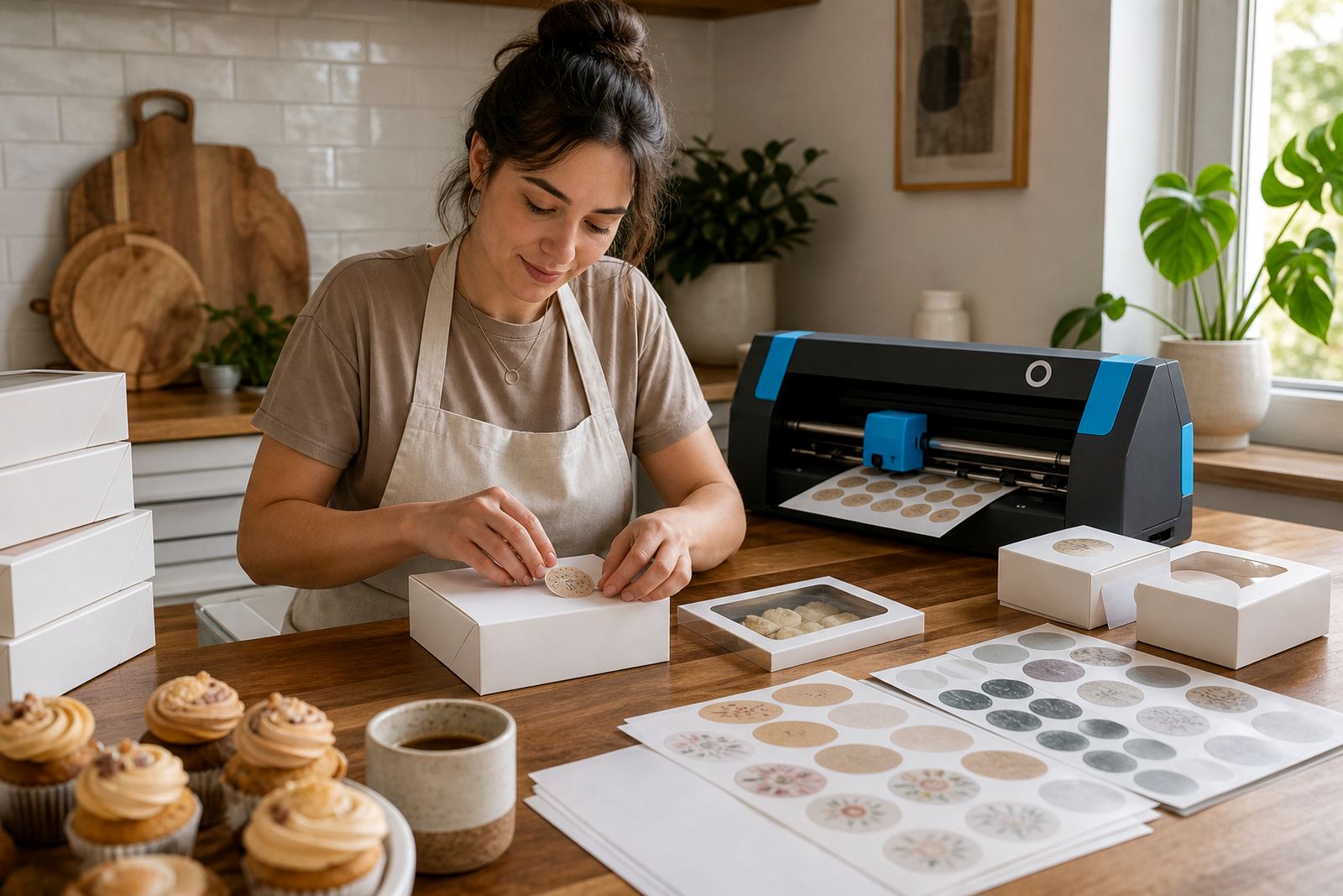
Some labels were cut by hand with a blade and ruler, while others were run through a craft cutter for repeat shapes. The straight edges were important on large storage tubs, and the rounded labels suited smaller spice jars. There was a small amount of trial and error with jar curves, but once the spacing was settled the labels sat neatly and stayed aligned. The final set looked orderly without being fussy.
- Week 1: finish selection, sheet sizing and label layout
- Week 2: printing, trimming and container-by-container placement
- Mixed cutting method used for speed and accuracy
- Labels grouped by pantry zones for easier application
What the pantry changed in daily use
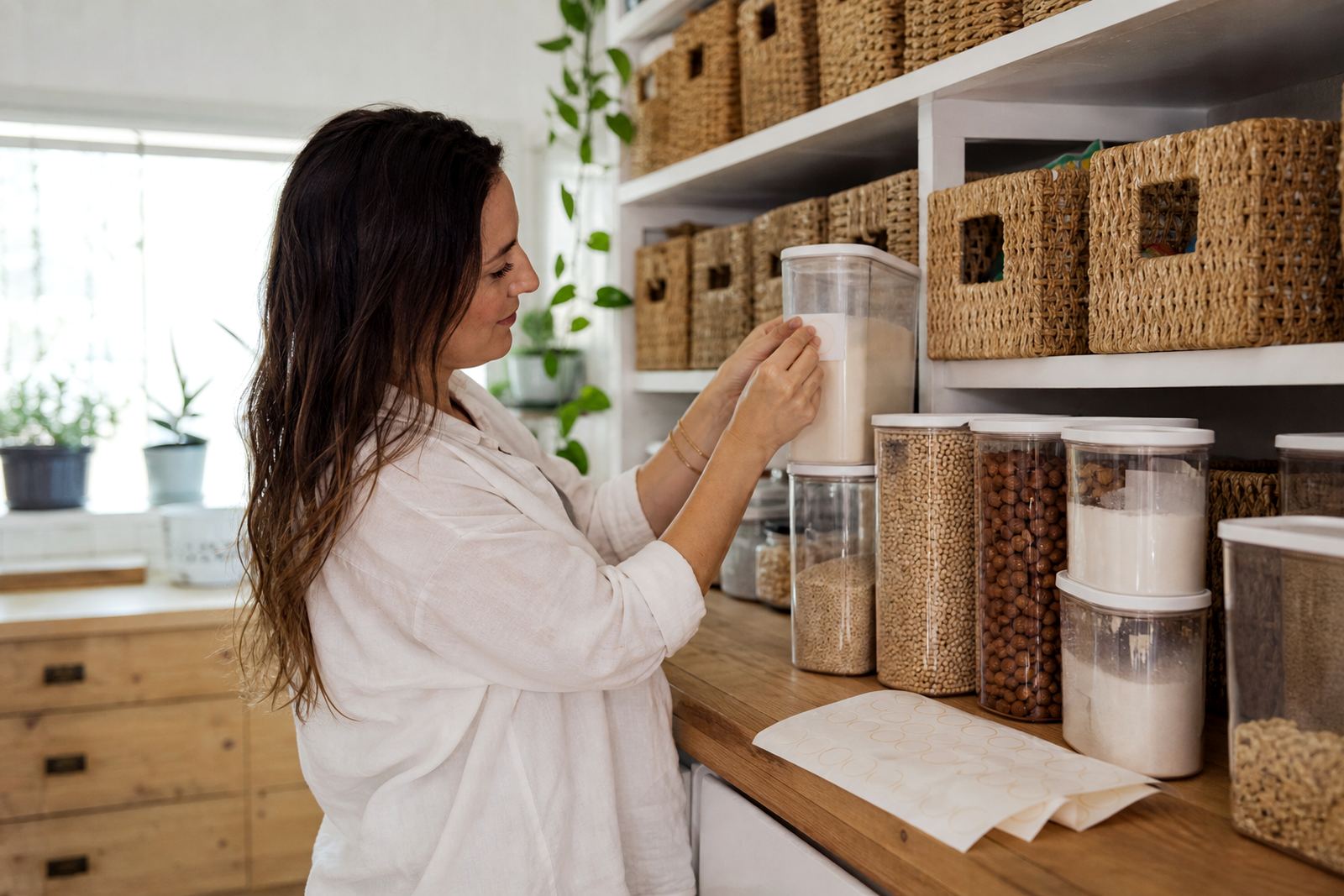
The result was a pantry that felt easier to use every day. Ingredients were easier to spot, refill decisions became more straightforward and the shelves looked finished instead of patchy. Clear labels let the container colour show through in the right places, while matte labels gave the eye a calmer surface to read from a few metres away. That balance worked especially well in a Brackenfell home with a busy family kitchen.
The organiser also liked that the system could be extended later without redoing the whole pantry. New jars can be matched to the same label style, and the same sheet mix can be used for seasonings, snacks or laundry storage. It is the kind of setup that holds up when the cupboard gets used hard, though the look stays tidy.
What we would do for a pantry label job
On a similar pantry refresh, we would keep the same split between clear and matte printable sticker paper. That combination gave the best mix of readability and calm presentation. We would also keep the label sizes modest, because oversized labels can crowd smaller jars and make the shelf feel busy. A restrained layout works better in most home kitchens, especially where containers differ in height and shape.
We would also keep the print and cut process grouped by zone, then apply labels in batches rather than all at once. It is easier to stay consistent that way, and the pantry ends up with cleaner lines. For homes in Cape Town and the surrounding area, humidity can affect storage a little, so flat sheet storage and dry handling before application are worth keeping in mind.
- Keep the label set limited to two or three finishes
- Use one typeface family for a consistent pantry look
- Group labels by shelf before sticking them down
- Store unused sheets flat in a dry place
Key facts
| Project location | Brackenfell, Cape Town |
|---|---|
| Client type | Home organiser |
| Paper finishes used | Clear and matte printable sticker paper |
| Printer compatibility | Inkjet and laser |
| Cutting methods | Hand cutting and craft cutter |
| Timeline | 2 weeks |