A George kitchen line with two very different finishes
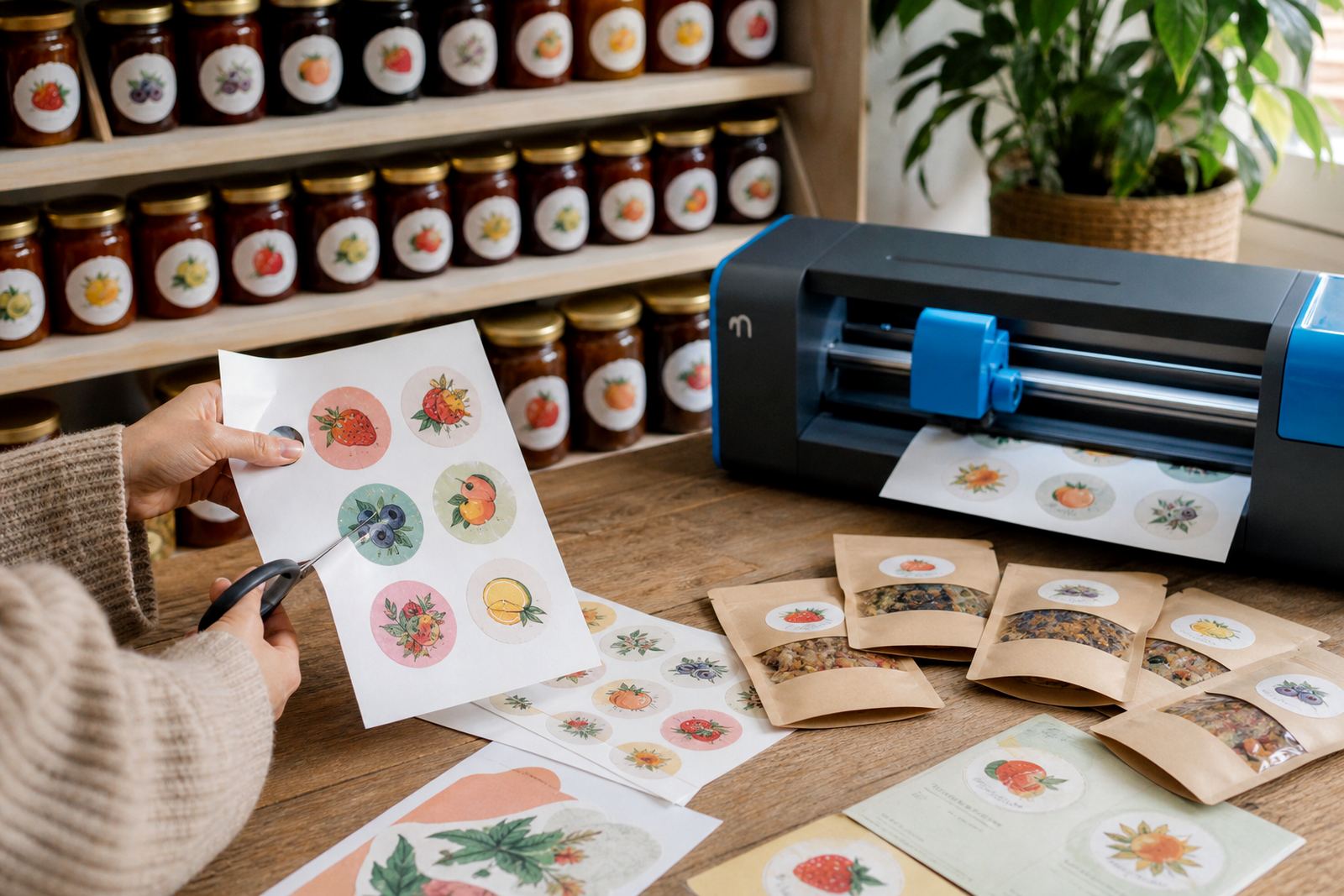
The brief came from a preserve maker in George who packed jams for local shelves, gift hampers and weekend markets. The jars needed a bright label that looked clean against glass, while the gift packs called for a warmer, more natural finish that matched the handmade feel of the products.
We worked with two sticker paper styles from our range. Gloss sheet labels were used on the jars for strong colour and a polished surface, while kraft stickers were chosen for the gift packs so the branding felt more rustic and personal. The client wanted a result that looked tidy on printed jars, but still worked in a busy packing room where labels are handled often.
What the brief needed from the paper
The jar labels had to print clearly with small ingredient text, batch notes and a simple brand mark. The gift pack stickers needed enough grip for paper bags, boxes and wrapped trays, with a surface that did not look too shiny next to twine, cardboard and tissue paper.
We kept the job practical. That meant matching the paper to the printer type, planning for neat trimming, and allowing enough margin so the labels could be cut by hand or with a craft cutter. The George team also wanted guidance on storage, because paper left in a humid kitchen can curl if it is not kept flat.
- Gloss sticker sheets for jar fronts and lid seals
- Kraft sticker sheets for gift pack branding
- Inkjet and laser compatibility guidance
- Cut lines set for hand cutting and craft cutters
- Storage advice for dry, flat sheet keeping
Sheet choices and print behaviour
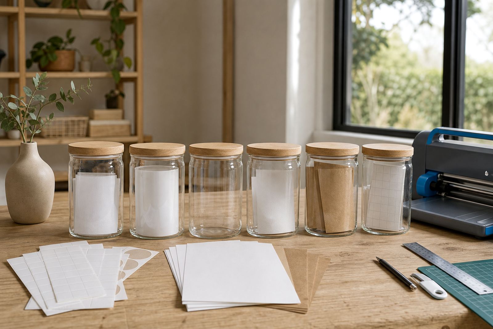
Gloss sticker paper was the main choice for the jam jars. It gave the labels a smoother face, strong colour and a clean finish that works well for product names, flavour wording and small legal text. On jars that may be wiped during packing or display, the glossy surface helps the print sit neatly and stay readable.
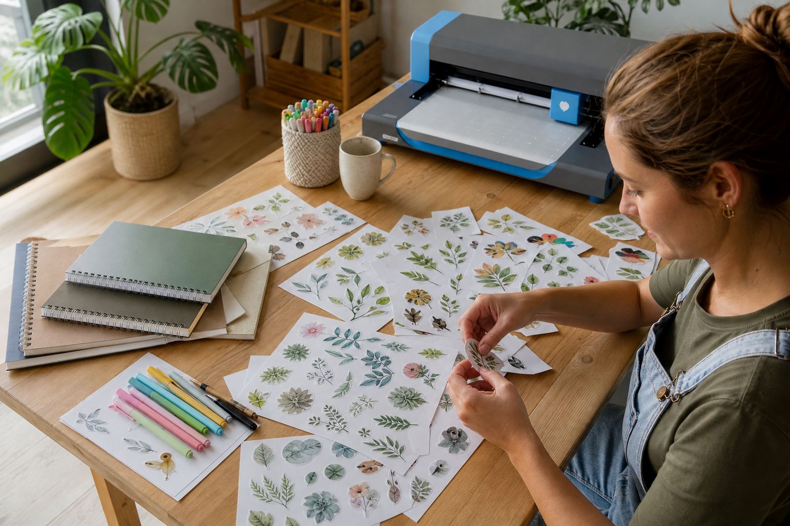
Kraft sticker paper was used for the market gift packs. It gave a more natural look, which suited the handmade style of the preserves. The brown tone also helped the packs feel less formal, without making the branding hard to read. For both finishes we set the specs around common home and small-business printing needs, including inkjet and laser use where the sheet type is suitable.
Clear sticker paper was not used on this job, but it remains useful when a label needs to disappear into the surface rather than sit on top of it. Vinyl sheets are a stronger option for labels that must handle more moisture or rougher use, although this project did not need that route.
Cutting, application and kitchen handling
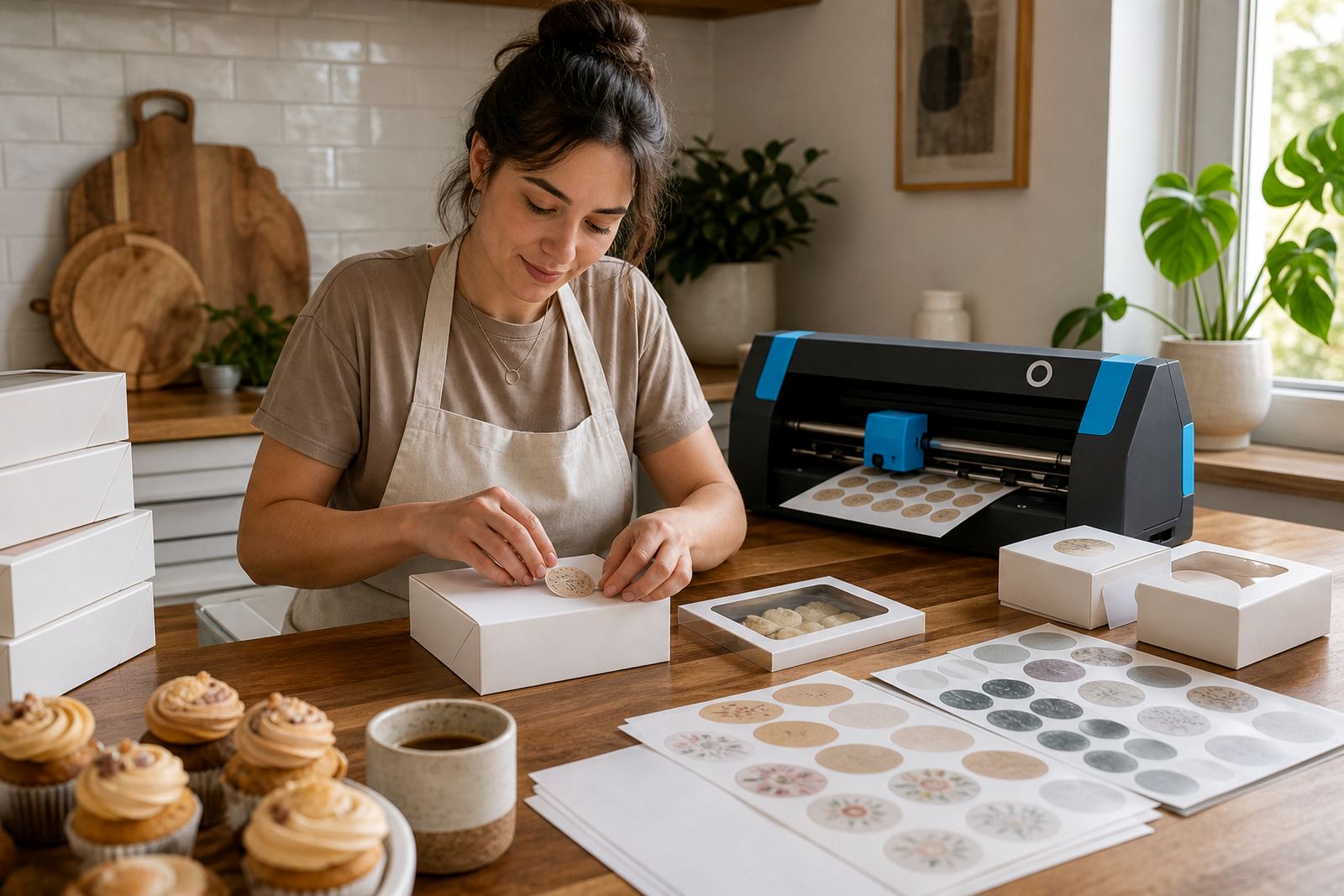
The client had to move quickly between printing, cutting and packing, so the layout had to be simple. We prepared the label sizes so they could be trimmed with scissors or a craft cutter without wasting too much sheet space. Straight edges suited the jam jars, while the kraft pack stickers had rounded corners to reduce lifting on the edges.
Application was kept straightforward. The jars were wiped dry before labels were applied, and the packs were finished after folding so the stickers sat flat. In a food setting, dust, steam and damp hands can affect how a label lies on the surface, so a careful packing routine matters as much as the sheet itself.
- Flat, dry surfaces before sticking
- Rounded corners for less edge peel
- Room left around artwork for safe trimming
- Labels kept flat in a cool, dry cupboard
The working period and the handover
The project ran over three weeks. The first week was spent confirming the label sizes, jar diameters and the pack formats used for market orders. In the second week the sticker paper choice was matched to the print method and the artwork was adjusted for readable text at small size. The final week was used for a print test, trimming checks and a full batch run for the seasonal packs.
That process helped the client avoid awkward reprints and saved time in the packing room. The finished sheets were consistent across both label styles, so the jars and the gift packs looked like they belonged to the same range even though the finishes were different.
What changed on the shelf and on the table
The finished jars had sharper front labels and better colour contrast, which made the flavours easier to spot on a crowded table. The kraft stickers gave the gift packs a more handmade look, and the overall range felt more organised without losing its local character. That mattered for a George maker selling to both regular customers and gift buyers.
The project also showed how different sticker papers can support different jobs inside one product range. Gloss worked best where clarity and colour mattered most, while kraft handled the warmer presentation on the packs. The maker could keep one brand voice, but use two finishes for two different sales settings.
Key facts
| Client type | Preserve maker in George |
|---|---|
| Project finish | Gloss labels for jars, kraft stickers for gift packs |
| Print compatibility | Inkjet and laser suitable, depending on sheet type |
| Cutting method | Hand cutting and craft cutter friendly |
| Timeline | Three weeks from sizing to batch run |
| Delivery reach | Cape Town, Johannesburg, Durban, Pretoria, Bloemfontein and wider South Africa |