
Screens show light, sticker paper shows ink
A screen makes colour with light, so it can look brighter than a printed sheet in hand. Sticker paper reflects light in its own way, and matte, gloss, clear and kraft finishes each change how the same artwork appears.
That is why a bright teal on your monitor may print as a softer blue-green on matte paper, while the same file on gloss can look a little deeper and more vivid. Clear sheets also behave differently, because the background behind the label affects what the eye reads as colour.
When you are making labels for jars, craft packaging or school files, it helps to treat the screen as a guide rather than a final promise. A colour viewed under cool office lighting in Durbanville may also read differently from the same sheet seen near a sunny kitchen window in Cape Town.
Finish changes the way colour sits on the sheet
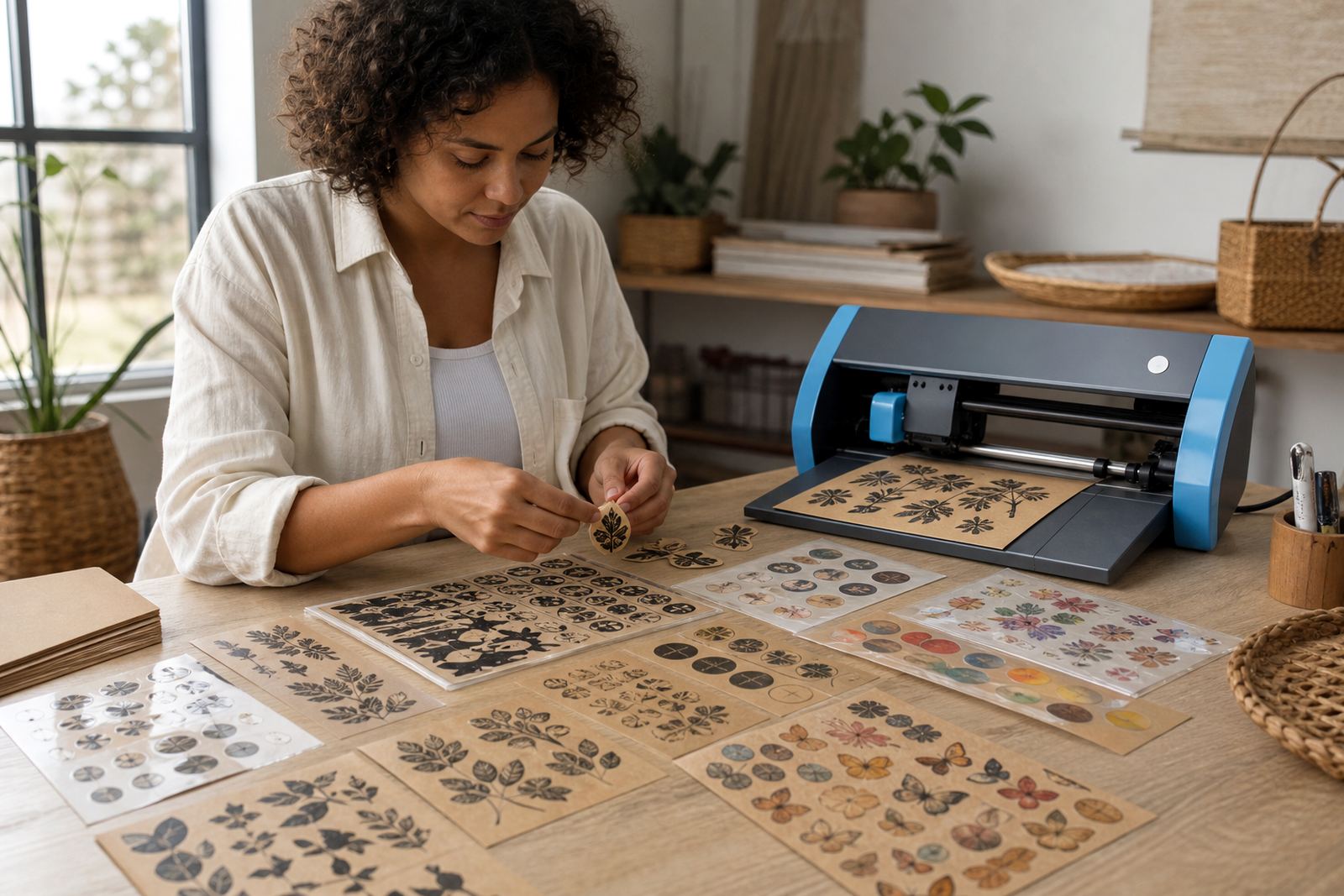
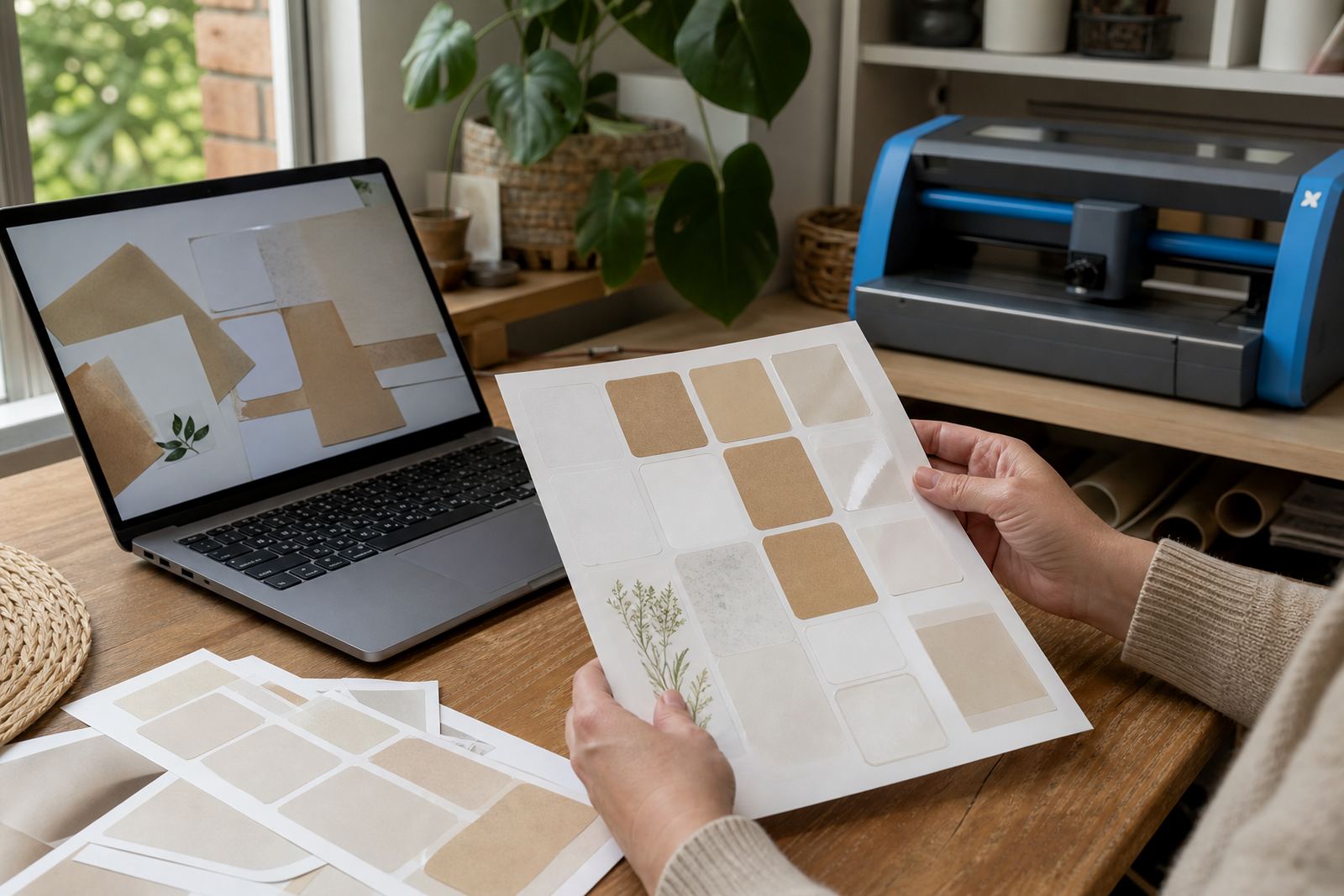
Each paper type takes ink in a different way. Matte gives a softer look, with low glare and more settled colour. Gloss adds shine, which can make darker tones look richer and brighter details stand out. Clear stock lets the label blend into the surface below, so whites and pale colours need more care. Vinyl gives a cleaner, tougher feel for items that may be handled often, while kraft gives a warmer, more natural tone.
- Matte suits labels where you want easy reading and less glare.
- Gloss suits gift labels, photo-like graphics and bold colours.
- Clear works well on glass jars, bottles and see-through containers.
- Vinyl helps when labels will be touched, moved or wiped often.
- Kraft gives earthy packaging a handmade look with muted colour.
The same file can feel more saturated on one finish and more restrained on another, so finish choice matters as much as the artwork itself. If your brand colour is important, test it on the exact paper you plan to use.
Inkjet and laser printers do not behave the same
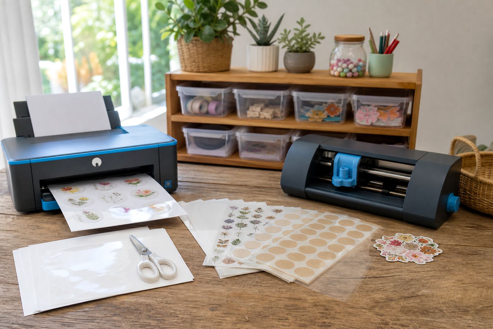
Inkjet and laser printers place colour in different ways, and that affects the final sheet. Inkjet ink soaks into the coating of the paper, while laser toner sits and bonds under heat. A paper made for one type of printer may not give good results in the other one.
Inkjet users often notice more variation in drying time and smudge risk, especially on heavier coverage or when the room is humid. In coastal areas like Durban the air can be sticky, so freshly printed sheets may need a little more space before stacking. Laser users usually get quicker handling, but the print can look slightly different because toner sits on top rather than sinking in.
Before printing a full batch, check that the sticker paper matches your printer type and your artwork is set up for the finish you are using. A colour-heavy label for pantry jars may need different settings from a simple black text label for storage boxes.
Test sheets save a lot of guesswork
Test printing is the cleanest way to understand your colour. Print one sheet with a few sample blocks, then view it in daylight, indoor light and the space where the labels will live. A green seen on a monitor can lean cooler in the morning and warmer by evening, so one quick check can prevent an entire stack from feeling off.
When you are comparing test sheets, look at more than the main artwork. Check text readability, border lines, skin tones if they appear in photos, and how dark backgrounds dry on your chosen stock. Small shifts matter when the labels are for wedding favours, school organisers or a gift hamper with a neat finish.
- Print a strip with your main brand colours.
- Include black text on pale and dark backgrounds.
- Compare the same design on two paper finishes.
- Let the sheet dry fully before judging the colour.
- Keep one sample aside for later comparison.
For local makers in places like Stellenbosch or Paarl, a test sheet also helps when switching between home printing and a local print service. The same file can behave differently, even if the artwork never changes.
Cutting by hand or with a craft cutter changes the final look
Colour does not stop at the print stage. Clean cutting affects how the label reads once it is applied. Jagged edges, lifted corners or uneven margins can make a rich colour look untidy, even when the print itself is fine.
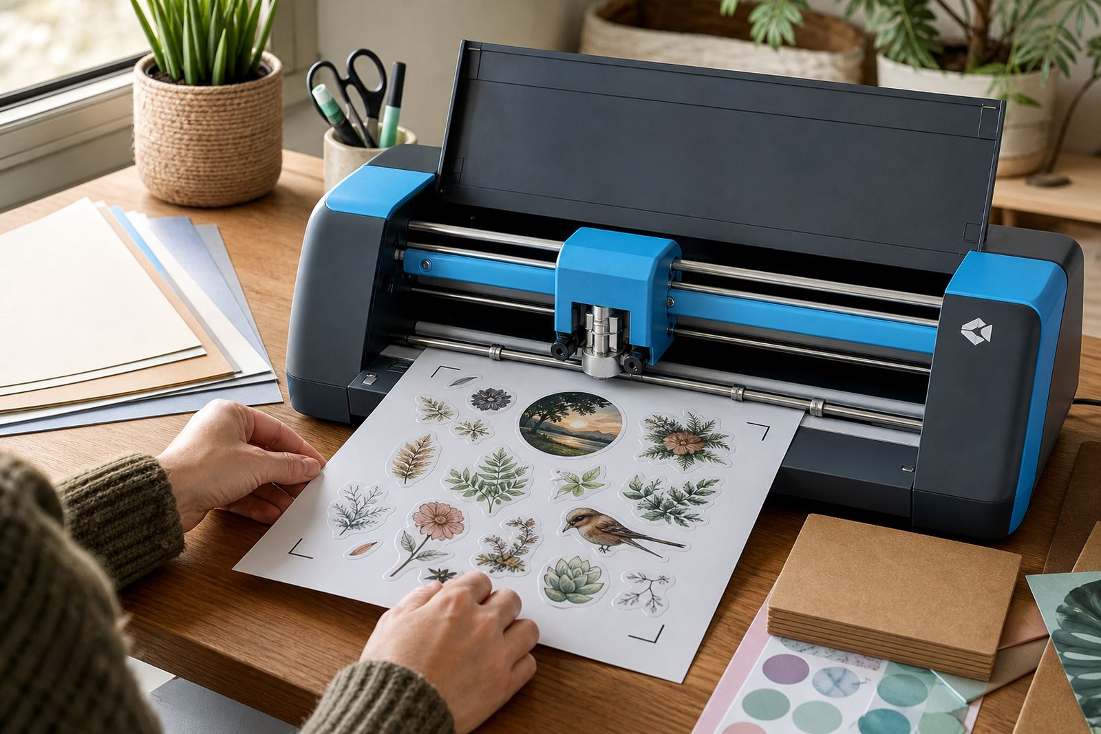
Hand cutting works well for simple squares, circles and small runs, especially when you need to adjust quickly. A craft cutter helps with repeated shapes, neat outlines and detailed sticker sheets. Clear sheets need extra care because cut lines and backing alignment show more easily, while gloss can show fingerprints if the sheet is handled too much before application.
If you are using a cutter, keep your cut lines slightly away from text or key graphics. If you are cutting by hand, use a sharp blade and steady pressure, because a frayed edge can make the colour seem less crisp than it really is.
A Durbanville kitchen label order tells the story
A homeowner in Durbanville may want matching labels for flour jars, tea tins and storage baskets, all printed on different finishes. The cream kitchen wall, the glass jars and the warm afternoon light can each change how the same beige or green appears. A label that looks balanced in the design file may look darker once it sits on a glass jar under cabinet lighting.
That is where a small colour test helps. One sample on matte paper may suit the pantry tins, while a gloss sample may work better on the glass spice jars near the window. If the same set is being sent to a second home in Pretoria, the dry inland light can shift the reading of the colours again, so one finish may fit both spaces better than expected.
For home makers, the goal is not perfect screen matching. The better goal is a printed result that feels consistent, readable and suited to the surface it will sit on.
Storage and handling matter before the sheet is used
Sticker paper keeps its best colour when it is stored flat, dry and out of direct sun. Moisture can affect the coating, and bent corners can make feeding through a printer less reliable. In coastal places, it helps to keep the sheets in their packaging until they are needed, then allow them to settle in the room where they will be printed.
Finger marks, dust and rough stacking can also affect the finished look. A clean sheet gives a cleaner print, and a clean print gives more honest colour. If labels are stored before use, keep them away from heat and damp cupboards, especially in a laundry or garage space.
Good storage will not change the colour profile of the artwork, but it can stop avoidable problems that make a good design look disappointing. That matters when the labels are meant for gifts, organised shelves or small batch products leaving Cape Town, Johannesburg or beyond.