
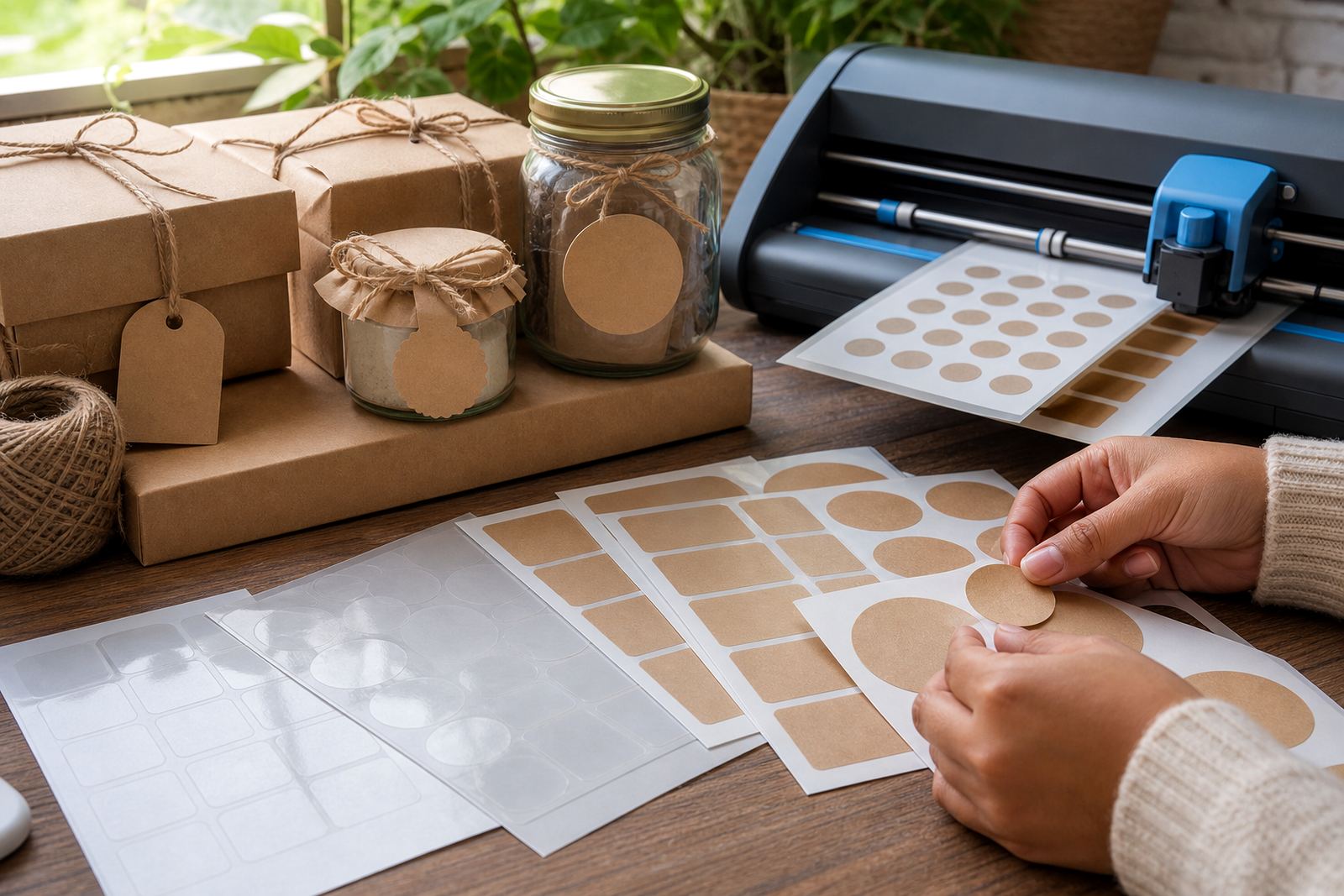
The kraft look that sits well on shelves and in hand
Kraft sticker paper suits work that should feel earthy, thoughtful, and easy to read. The brown paper tone softens strong colours, so black text, line drawings, and simple logos stand out without looking harsh. That makes it useful for jar labels, soap packs, candle seals, bakery wraps, and small gift notes.
For Durbanville makers packing orders at home, the kraft finish also hides small handling marks better than plain white stock. It can be a good fit for products that move from a kitchen table to a market stall, then into a gift bag. The finish has a familiar paper feel, so the printed result often looks less glossy and more handmade.
What to print on kraft paper when the design must stay clear
Because kraft has a darker base colour, designs usually work best when they stay simple. Strong contrast matters. Dark text, bold borders, and plain icons print more cleanly than pale pastel artwork that can fade into the background. If a label must be read from arm’s length, keep the wording short and the type size large enough to hold up after cutting.
- Use black or very dark ink for ingredient notes, names, and dates.
- Leave open space around the main message so the label does not feel crowded.
- Keep fine detail to a minimum, especially on small round labels.
- Test one sheet first if you are printing a batch for a market or gift order.
For home use, kraft works well on pantry jars, school snack tubs, seed envelopes, and storage boxes. It gives the label a calm look that suits kitchens, workrooms, and gift tables. Small spelling checks matter too, because the natural paper finish makes every mark feel more intentional.
Inkjet or laser, and where the finish changes the result
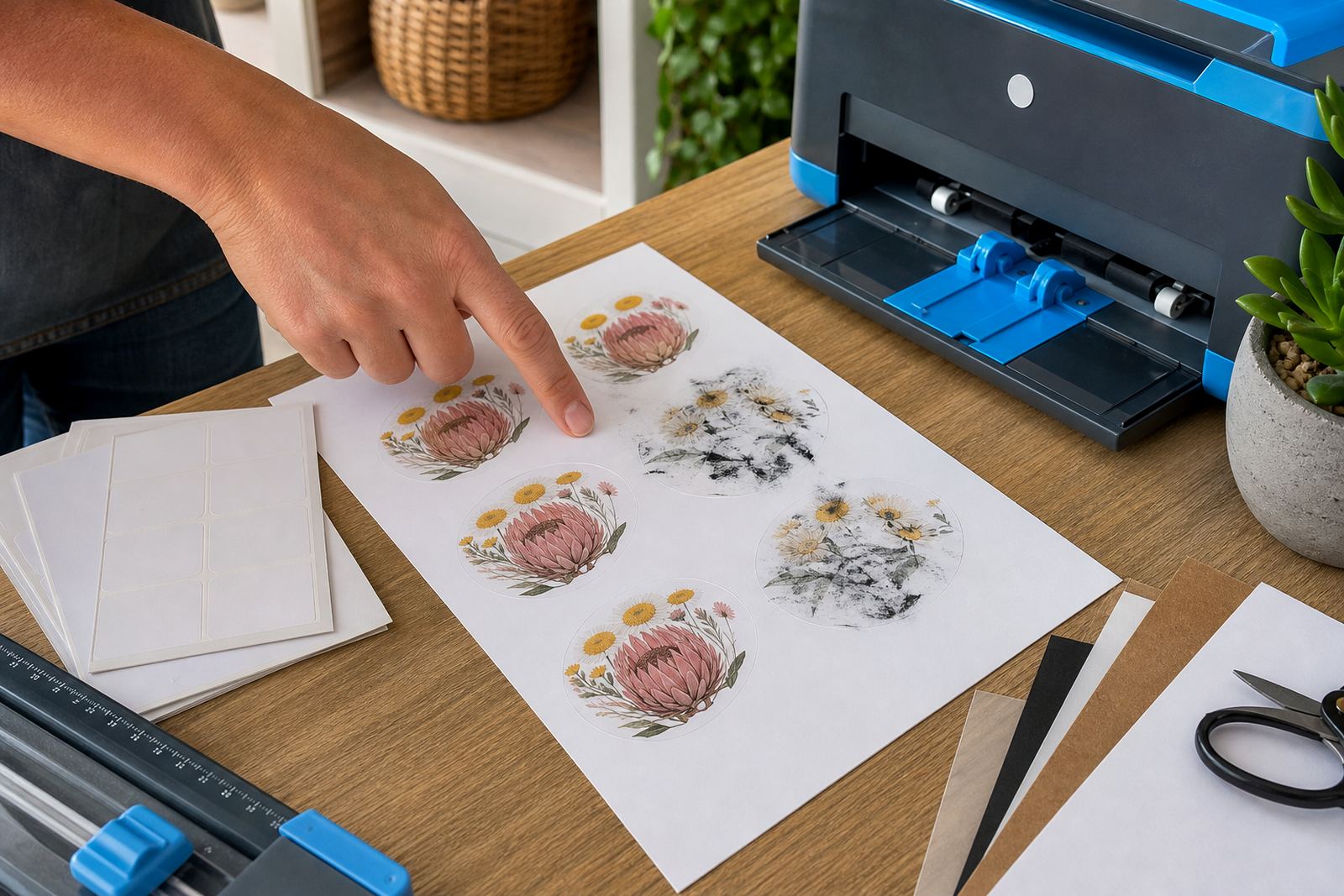
Kraft sticker paper can be paired with inkjet or laser printing, but the print feel changes with the machine and finish. Inkjet suits soft artwork and small household labels, while laser often gives firmer text and sharper edges. For either method, the paper should feed neatly, with clean settings that match the sheet type and weight.
Matte kraft is usually the safest place to start when the design is practical and text-led. It keeps glare down and makes handwriting-style fonts easier to read. If the paper has a smoother coating, colours may appear richer, but the result still keeps that paper-based look that suits packaging and gift tags.
- Check print alignment before running a full batch.
- Allow printed sheets to settle before cutting or handling.
- Store unused sheets flat, away from damp corners and dust.
- Keep a spare sample for reprints, colour checks, and cutter tests.
Hand cutting for short runs and careful presentation
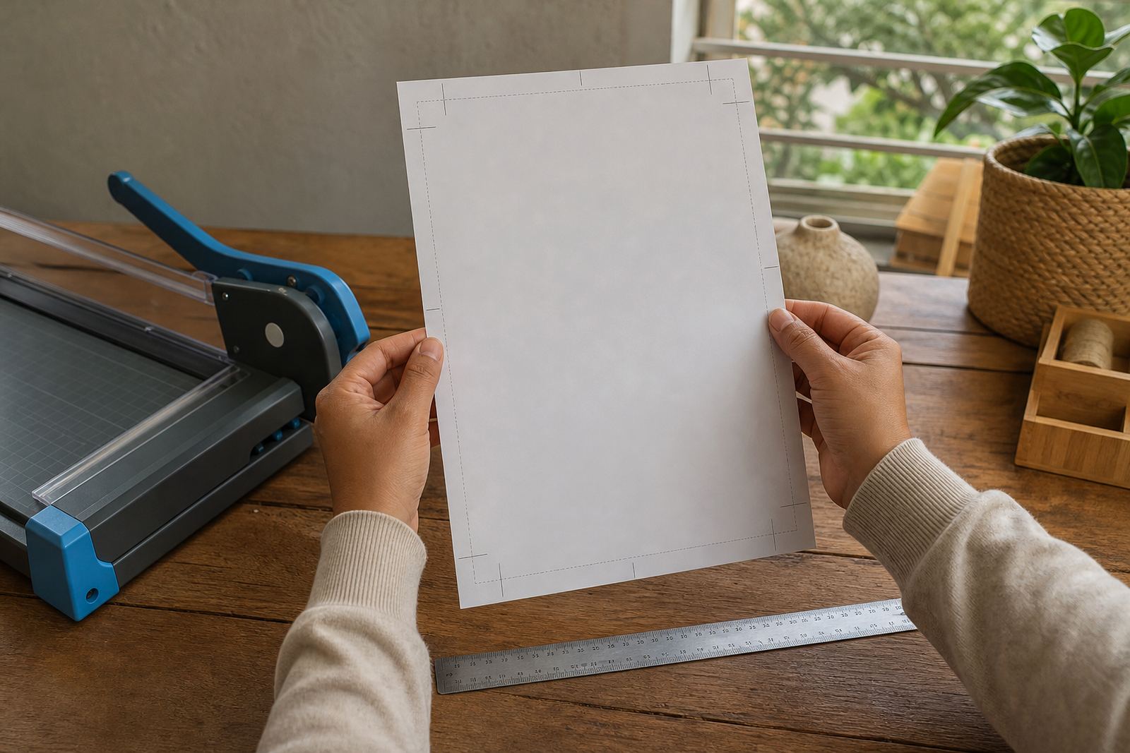
Hand cutting suits small batches, mixed label sizes, and one-off gifts. A sharp pair of scissors or a craft knife gives enough control for simple shapes, especially when the design has a clear border. Straight cuts can look tidy on kraft because the paper tone already feels relaxed and natural. It does not need perfect symmetry to look good.
For jars, favour a slightly larger label than the lid curve so the edges do not lift during use. If the label is going onto a box flap or paper pouch, press from the centre outward and smooth the corners last. The paper grips best on a clean, dry surface, so wipe away flour, dust, or loose fibre first.
- Cut on a firm mat so the edges stay clean.
- Leave enough border around text and artwork.
- Round sharp corners if the item will be handled often.
- Use a paper folder or ruler for straight folds and creases.
Craft cutter settings and label shapes that suit the paper
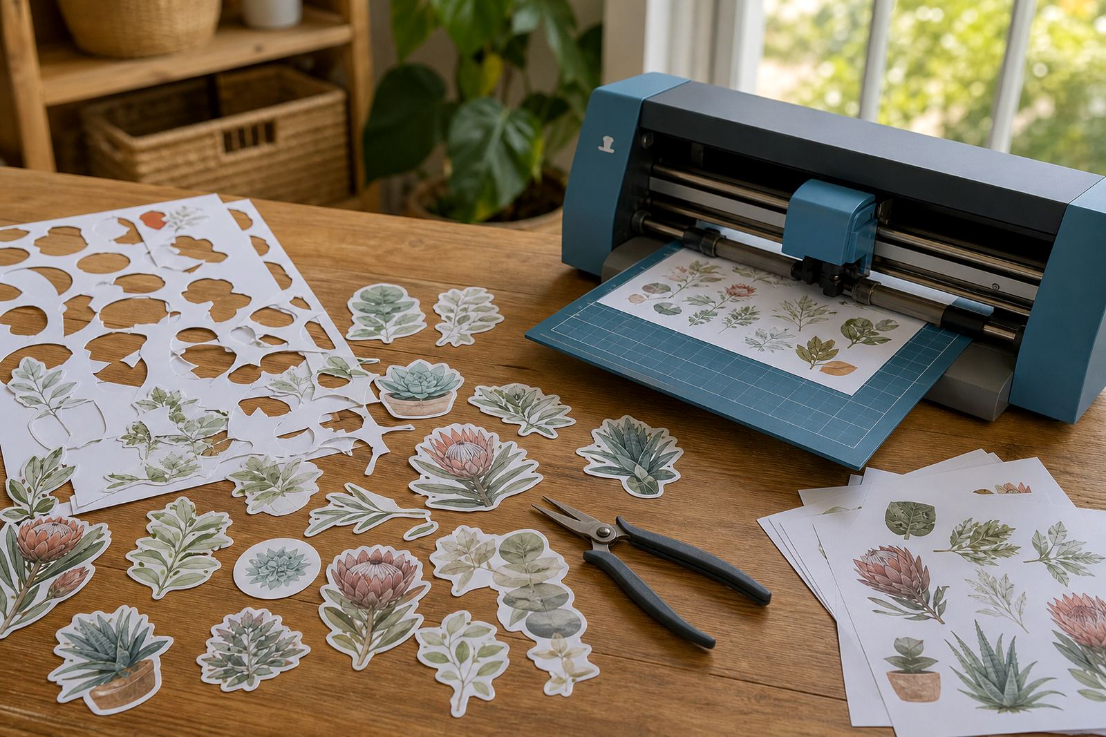
A craft cutter is useful when you want neat repeats for batches, gift sets, or store packaging. Kraft sticker paper usually works well with simple shapes such as circles, ovals, squares, and rounded rectangles. Those shapes cut cleanly and leave less risk of lifting corners during peeling or storage.
For a mixed set, try a larger main label and a smaller seal label in the same artwork. That keeps the order neat without making everything look identical. If you are using a cutter, keep the blade path plain and avoid tiny interior cuts unless the design really needs them. Small details can be charming, but too much detail is harder to weed, sort, and apply.
- Use test cuts before running a full sheet.
- Keep the artwork spacing generous between each label.
- Choose rounded shapes for items that will be handled often.
- Match the label size to the container, box, or packet edge.
A Durbanville example that works for markets and gifting
A small Durbanville home baker might use kraft labels for rusks, biscuit jars, and seasonal gift packs headed for a weekend market in Cape Town. The labels can carry a plain product name, a short flavour note, and a batch date in dark print. That keeps the packaging orderly without losing the handmade feel people often like at local stalls.
For coastal customers, the paper also helps the packaging feel less slick on humid days, though storage still matters. Keep finished labels in a dry cupboard, not near a stove or open window where moisture can curl the sheets. If the order is going to Johannesburg, Pretoria, or Bloemfontein, sturdy flat packing helps the sheets arrive ready for use and less likely to bend.
Kraft labels for gifts, storage, and plain everyday order
Kraft sticker paper is handy when the goal is not a flashy finish but a neat natural one. It suits pantry jars, hobby boxes, refill pouches, soap wraps, and personal gifts made at home. The look stays warm and grounded, which is useful when the item itself should feel homely rather than glossy.
Clear instructions, simple artwork, and careful cutting usually do more for the final result than busy design tricks. If the label is meant for a kitchen cupboard, a gift basket, or a storage tub, make the wording easy to scan and keep the layout balanced. That approach lets the paper do the visual work while the message stays practical.